Creating Fictional Alphabet for a Film
- Nov 1, 2025
- 2 min read
Updated: Nov 3, 2025
Have you seen the movie “Measure in Love (他年她日)”?

Premiered at the Busan International Film Festival and screened across multiple Asian territories in the autumn of 2025, this fantasy romance film unfolds in a unique sci-fi world. A massive earthquake creates a “gravity wall,” splitting the world into two zones with different gravity and time flows. The Aurora Zone (優日區) is a tech-focused city where time moves slowly and gravity is stronger, while the Evergreen Zone (長年區) is an industrial town where time passes much faster and gravity is weaker.
The Creation Process
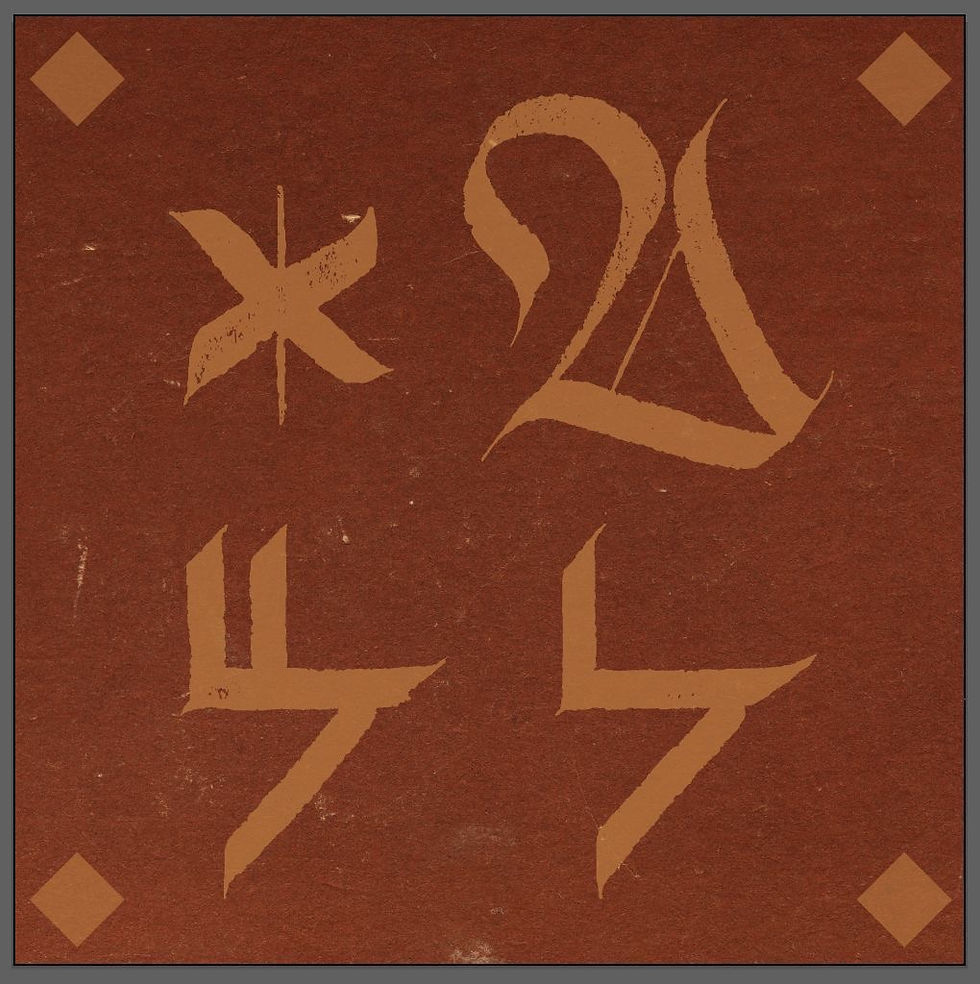
Isolated by time, gravity, and hardship, Evergreen evolved its own written language—visually distinct from Aurora—which reinforces the separation of culture and experience throughout the film. It’s in this divided world that I was invited to invent a new written language for the Evergreen Zone earlier last year.
The art team provided me with 26 unique characters as a starting point and asked me to reinterpret them using my Gothic script style. My “Gothic Ikebana – Patina Edition,” with its corroded textures and antique energy, turned out to be a surprisingly good match for the spirit of the Evergreen Zone—corroded, aged, industrial, and full of character shaped by adversity.

The trickiest—and most fascinating—part was transforming the 26 unique characters into something distinctly Gothic while preserving their unconventional forms. The original font set looked almost like math symbols, geometric icons, and digital glyphs—nothing at all having any relation to Gothic.

To “gothicize” each letter, I infused the Fraktur strokes—round curves, S curves, and even the iconic Swan shape—into the transformation of those symbols. If you’re familiar with Fraktur, maybe you can spot those influences in the final forms; you may even find actual Fraktur alphabets hidden in the set. This process was challenging, but deeply meaningful—like inviting the soul of my Fraktur calligraphy into some alien symbols, making something strange suddenly feel related.


If you’ve watched the film, you might spot my lettering woven throughout the Evergreen Zone—the industrial city where time moves faster and life feels raw and rugged. It’s surreal to see my script living and breathing within this world—blending into the setting, costumes, environment, and characters themselves.


Now, the fun part!
Below are some props from the film featuring my script. If you’ve watched the film or are simply curious, why not decode them and discover what’s written?


Thank you for reading my creation story,I hope you enjoyed it! I’ll be sharing more behind-the-scenes insights, processes, and creative adventures in upcoming blog posts.
If you’d like to be notified when the next post is live, feel free to join my newsletter.
See you next time! 😊
In ink,
Stella


